TIME

August 5, 2015
This is my proposal for a redesign of the famous TIME magazine logotype.
I incorporated two clock hands in place of letter M’s inner strokes, so that they would discreetly evoke time.
This was based on one of my old ideas, made some 4 years ago:

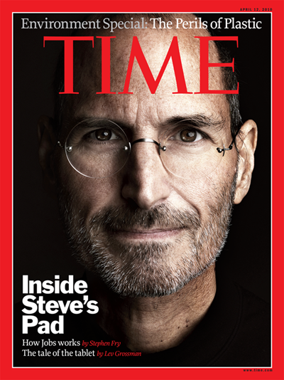
Here is the original TIME logotype on the cover of the magazine:


Leave a Reply